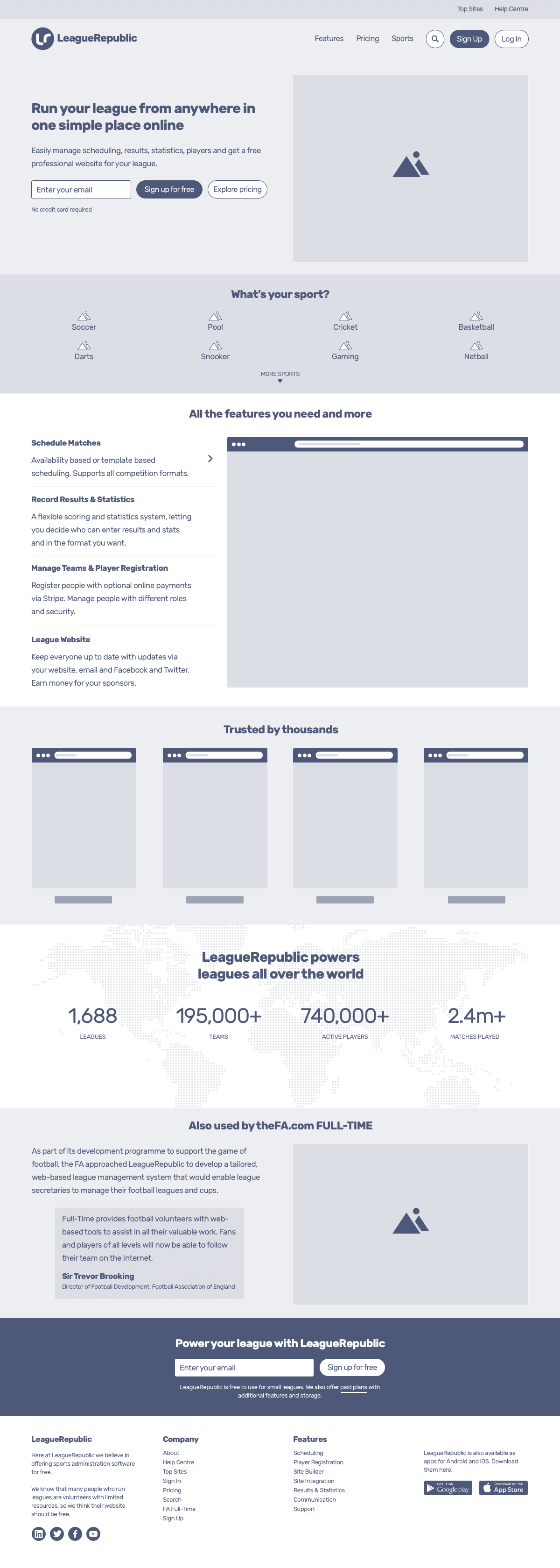
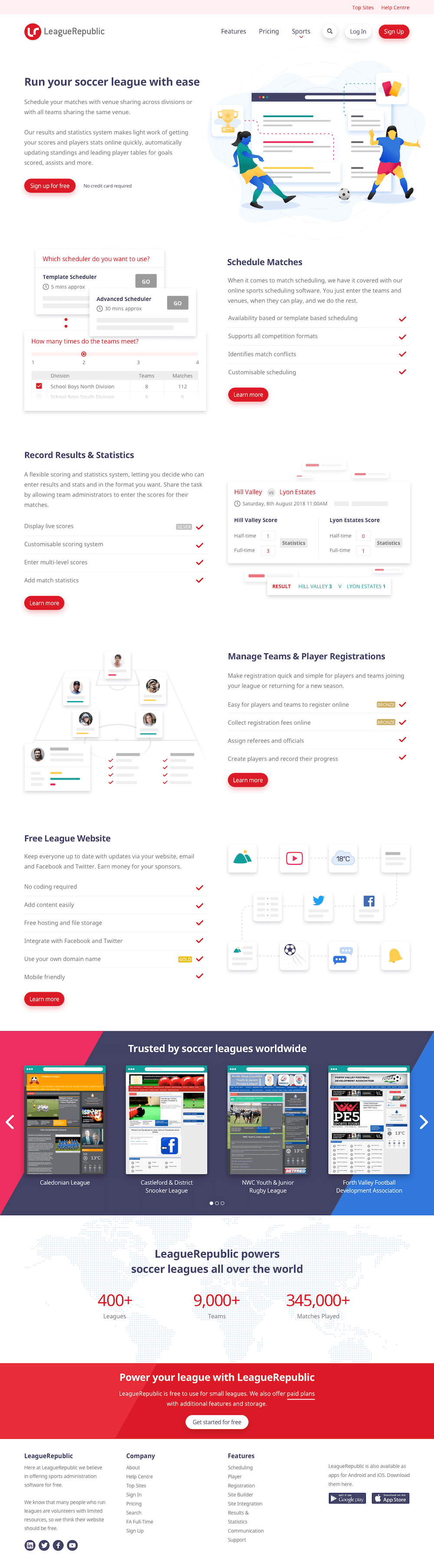
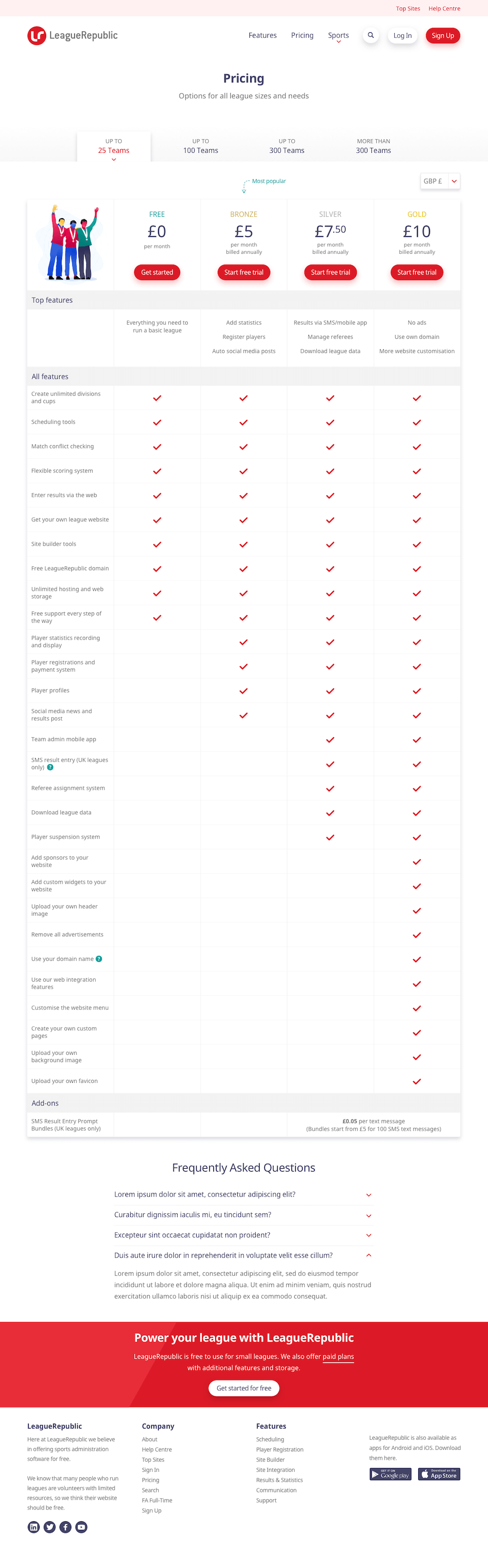
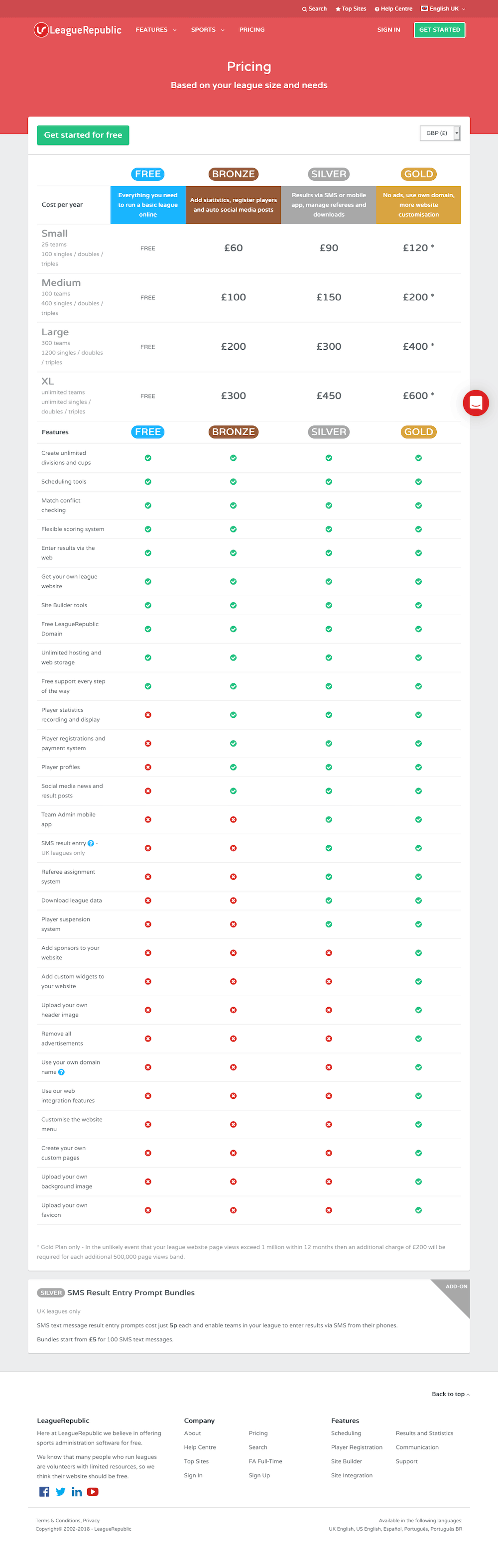
Case Study

Redesigning LeagueRepublic

The new website design aimed to increase signups and explain more clearly what the software does. To do this there had to be more focus on features relevant to specific sports.

LeagueRepublic is a web-based sports administration software that enables easy management of scheduling, results, statistics and players.

I last worked on the LeagueRepublic designs over ten years ago, so it was a pleasure to have the opportunity to work with them again on the recent website redesign.

I Provided

  • Wireframes
  • Visuals
  • Illustrations
  • Responsive HTML/CSS templates
The old LeagueRepublic homepage.
A

Analysis & preparation

The first step was to have a look at the current website to see what issues needed to be addressed in the redesign.

  • On the homepage, the header/call-to-action is too red which hides the branding. The priority seems to be given to the mobile apps with the mobile screenshot and app store logos taking a significant portion of the page above the fold.

    Mixed messages on the homepage - It starts off with running your league, then into features, but by the end of the page it says "ready to start building your free website".

The old LeagueRepublic features page.
B
The old LeagueRepublic pricing page.
C
  • The content on the feature pages is quite heavy and difficult to follow. Increasing the font size and breaking the content with subheadings would help.

  • The pricing table displays an array of prices and options making it difficult to understand. It's also not very clear whether the costs are annual or monthly.

A moodboard created in Pinterest for the design and wireframe phase of the project.

Creating a mood board

After all the issues were identified, I collected a few design ideas and inspiration from some other software services and added them to a Pinterest board which I shared with LeagueRepublic.

The shots I had collected on the mood board, provided inspiration for layout styles, illustrations, pricing tables and even wording for the signup elements.

Based on this collection, I began wireframing the key pages of the site.

Wireframe created for the features page of LeagueRepublic.
D
Wireframe of a sports page.
E

Wireframes

Whenever I start a new design project, I always spend a few hours conceptualising pages, elements and functionality with sketches.

Aside from being relaxing, drawing out basic sketches helps to test those ideas before creating more polished wireframes.

These wireframes were created initially in Sketch and then converted to HTML/CSS to enable LeagueRepublic to get a better feel for the site layout.

  • Features page
  • Sports page
  • Homepage
Wireframe of the homepage.
F

Type that works

For the new design, I wanted a font that worked nicely with the type used on the LeagueRepublic logo (Conduit ITC) and which was available without any licensing costs. After evaluating dozens of typefaces, I decided on the Google font "Noto Sans" which comes in both Regular 400 and Bold 700.

  • Noto Sans Regular
  • Noto Sans Regular Italic
  • Noto Sans Bold
  • Noto Sans Bold Italic

Colours that compliment

The red brand colour of LeagueRepublic is intense, so I wanted to keep away from using too much of it. I came up with a palette of six colours that would compliment the brand colour well, and that would also work well in any illustrations.

#DC1A27 - brand colour

Static visuals

The mood board and wireframes created in the previous stage helped to guide the design for the new website.

There were a few common design styles that could be seen throughout the mood board: larger fonts, use of illustrations to convey the message, good use of whitespace and simple, easy to follow content.

For the new design, I wanted to keep away from showing too many screenshots as they are not always clear enough to the user. The UI mockups were designed in Sketch App.

  • Homepage - Compared to the old homepage, the new design offers more visual indications as to what the LeagueRepublic software is about, through the use of relevant illustrations, imagery and subtle animations.
Design for the new homepage.
G
  • Pricing Page - The old pricing page was very confusing and complicated, so I created tabbed sections to split the pricing into more relevant and presentable information.
Design for the sports section of the LeagueRepublic website.
I
  • Sports Pages - With the sports pages, I wanted to provide quick snapshots of core features. To do this, I created illustrations for each feature.
Design for the pricing page.
H

Illustrations

I designed illustrations for the homepage, pricing page and each sports page which were all created in Affinity Designer and exported in SVG for maximum scalability.

Homepage illustration.
Basketball illustration.
Snooker illustration.
Soccer/Football illustration.
Pricing page illustration.
Netball illustration.
Darts illustration.
Pool illustration.

Putting it all together

The final part of the project was to convert all the visuals into responsive HTML/CSS templates that the LeagueRepublic developers could work with. I also used Sass, to organise the CSS more efficiently and jQuery for small interactive features.

View templates